.png)
Benefits app
2022 | Ashmoret
A mobile app providing teachers with benefits and discounts.
Project Name
Ashmoret – Benefits App for Teachers
Role
Platform
Duration
UI Designer
Mobile (iOS & Android)
2022– 2023
Project Overview & Context
Overview
Ashmoret is a mobile application that provides exclusive discounts, benefits, and perks for teachers in Israel. The app brings together a wide variety of offers from different vendors — from restaurants to office supplies — into a single, simple, and intuitive experience.
As the UI designer on this project, my responsibility was to create a clean, accessible, and friendly visual interface, based on an existing concept and wireframes provided by the product team.
Target Audience
The primary users of Ashmoret are teachers — a diverse group in terms of age, digital literacy, and smartphone habits. Some are tech-savvy, but many prefer familiar and easy-to-use apps. This required a visual language that was not only attractive but also trustworthy and low-friction.
My design decisions were shaped by internal discussions with the client, competitive analysis, and key usability principles aimed at reducing cognitive load.

My Focus
While I was not involved in the UX research or wireframing phase, my work centered around translating user needs and business goals into an effective, modern, and cohesive interface. I collaborated closely with the developers to ensure pixel-perfect delivery, consistency, and responsiveness across devices.
Design Approach

Suggested Visual

Design Process
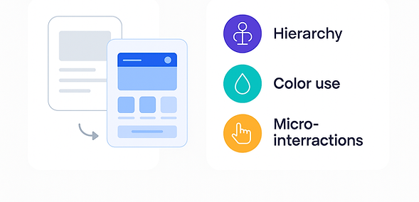
Visual summary of my UI design process:
from wireframes to a refined user-friendly interface.

Key Screens & UI Elements
Key Screens Overview
These core screens reflect the main user journey in Ashmoret:
Browsing personalized offers
Exploring categories
Viewing benefit details
Redeeming deals easily
Design priorities included clarity, scannability, and trust — achieved through visual hierarchy, readable text, and intuitive CTAs.


Handoff & Collaboration
I worked closely with the product and development teams to ensure a smooth design-to-development handoff.
All UI screens were delivered via Figma, using structured components, reusable styles, and proper annotations for interaction states.
We maintained ongoing feedback loops throughout implementation to ensure accuracy, responsiveness, and alignment with the design vision.
Reflections & Takeaways
Working on Ashmoret taught me how to design for a diverse user group — including users who are not necessarily tech-savvy.
It reinforced the value of simplicity, visual hierarchy, and consistency when designing UI without a direct UX research phase.
If given more time, I would have loved to collaborate on usability testing and refine the interface based on real feedback.
This project strengthened my ability to adapt quickly, think practically, and focus on what truly matters to users — clarity, confidence, and ease of use.
Thank you!!